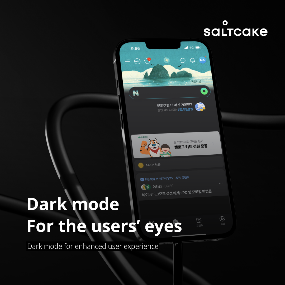
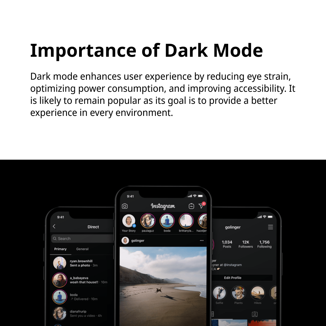
Dark mode has become a popular choice across many apps and websites for several positive reasons. To ensure that all users can conveniently utilize dark mode, we need to carefully consider various design elements.
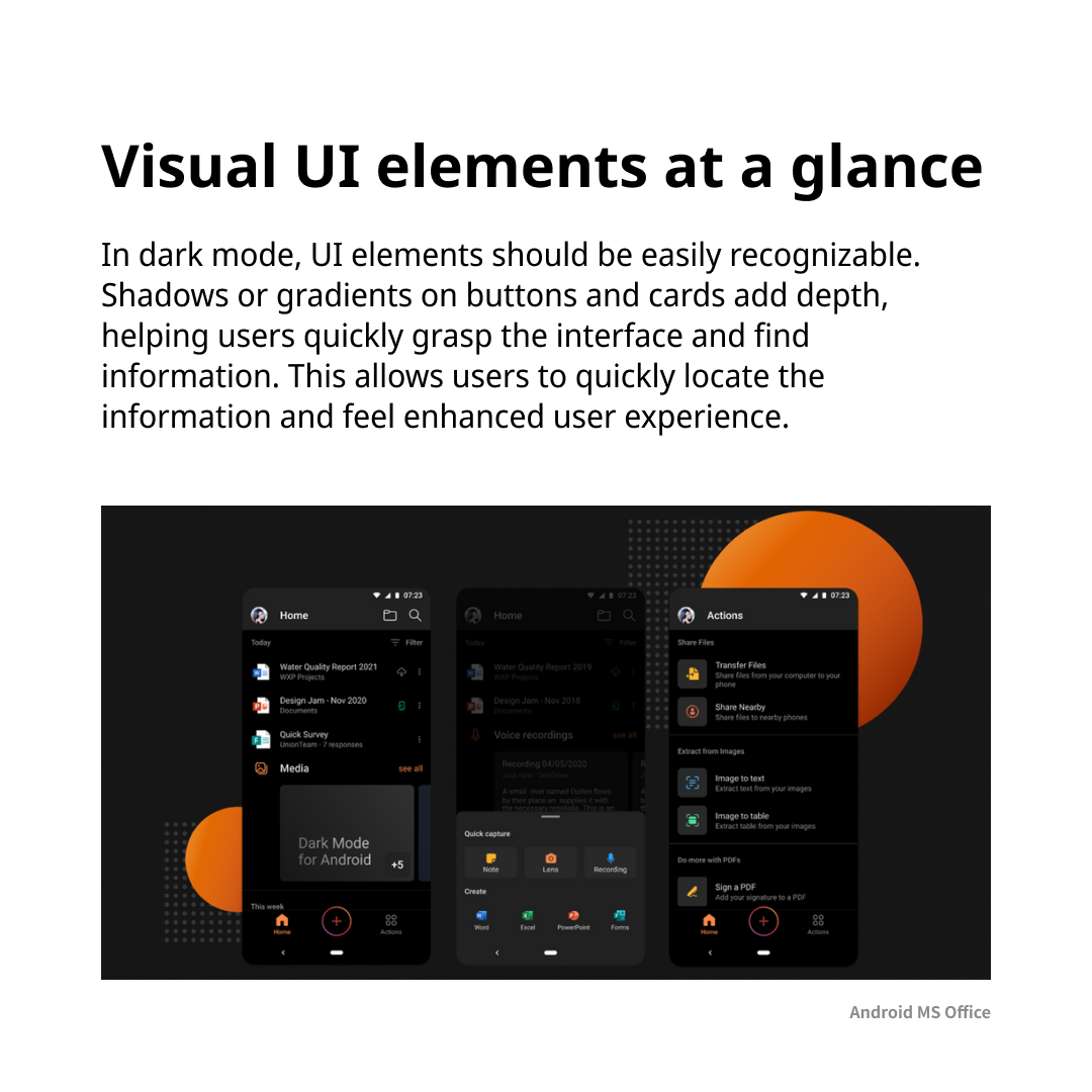
Emphasizing elements so that they are easily recognizable in dark mode allows users to understand the interface structure more readily and find the information they need quickly.
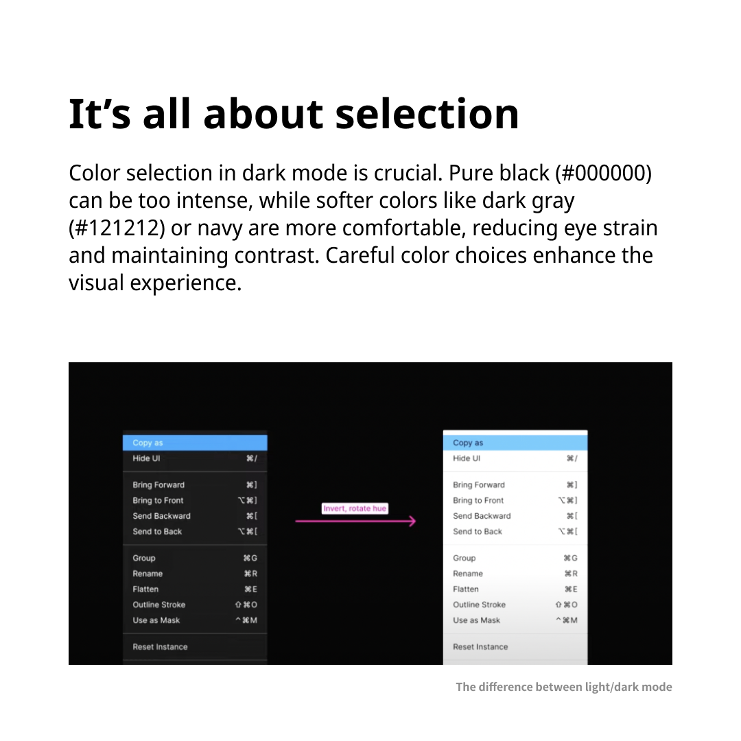
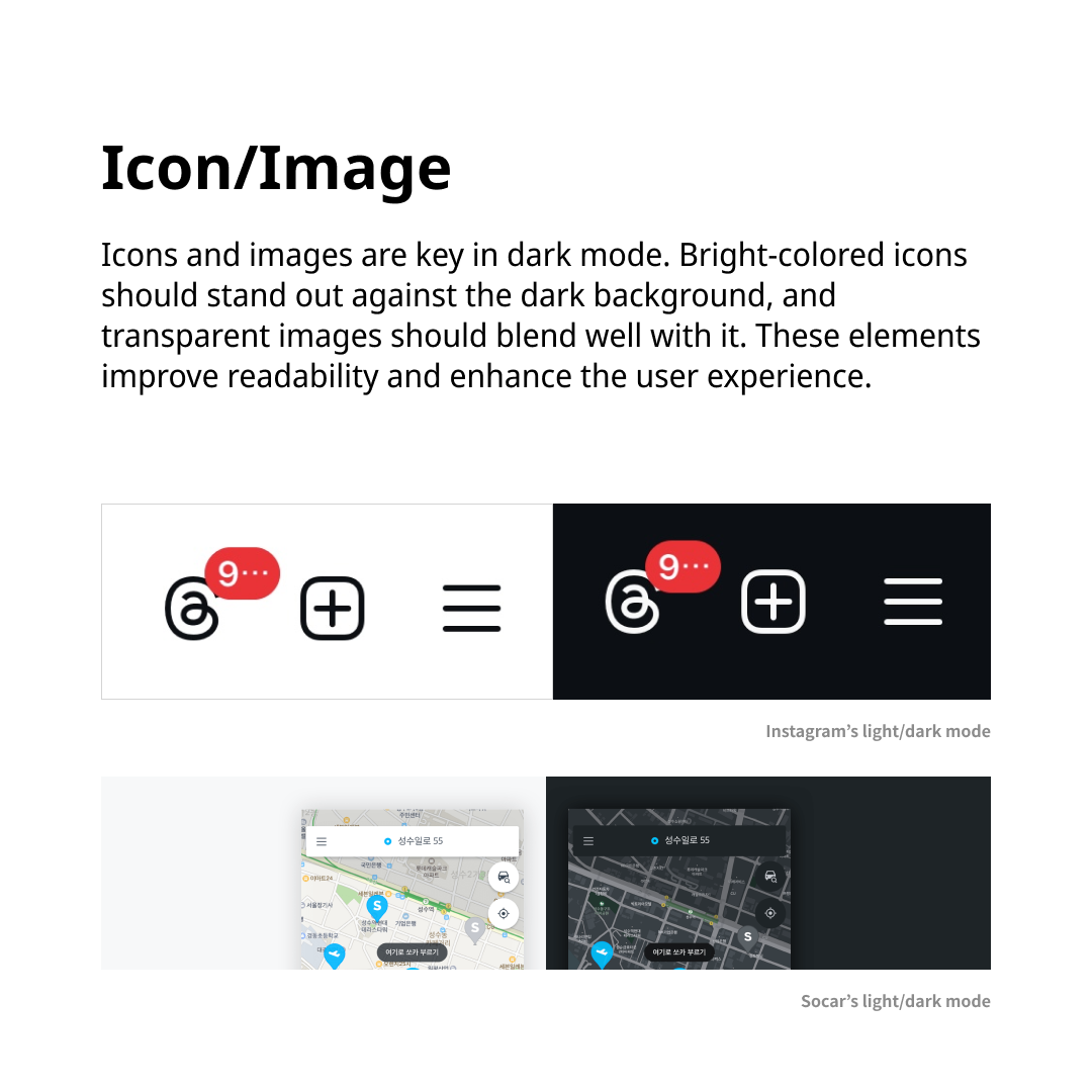
Color selection is crucial in dark mode. For instance, soft colors like dark gray or navy can enhance text contrast while reducing eye strain. Icons and images should be clearly visible against dark backgrounds and appropriately adjusted to create overall harmony.
Dark mode is not just a simple design choice but an essential factor in improving user experience. Going forward, the goal of design is to provide a better experience for users through dark mode.
We upload essential trend insights every week. Don’t miss out, stay tuned, follow @5boon_ux for more!