
5Boon_UX
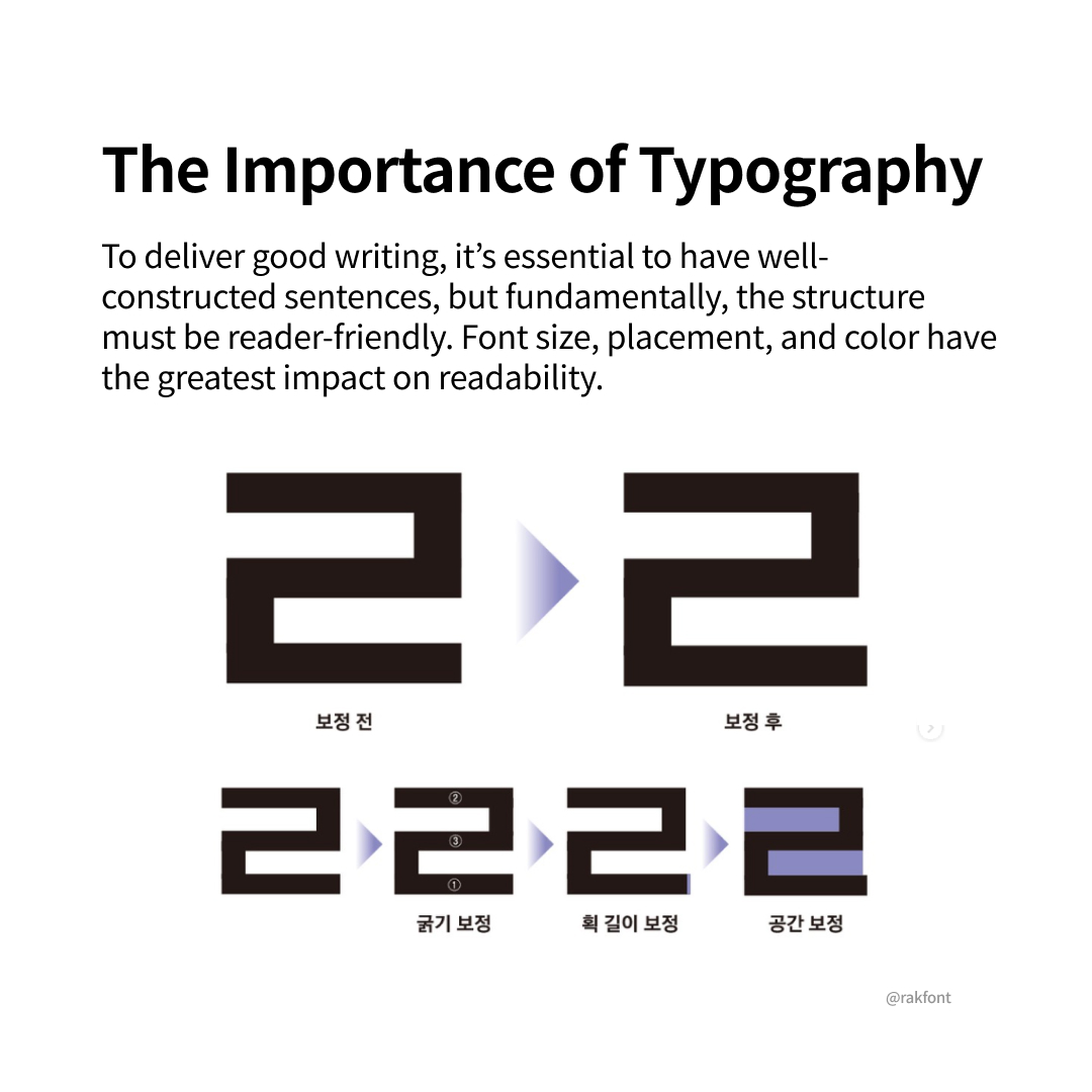
To convey a good piece of writing, it is essential to have a structure that is easy to read. Elements such as font size, layout, and color have the most significant impact on readability.
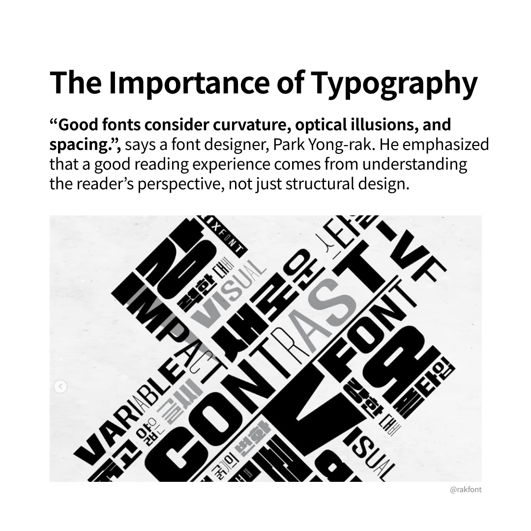
Font designer Park Yong-rak emphasizes that creating a good reading experience involves considering various elements such as fonts, optical illusions, and spacing. This means that rather than focusing solely on structural design, one should view fonts from the perspective of the reader, ensuring that the design provides visual stability.
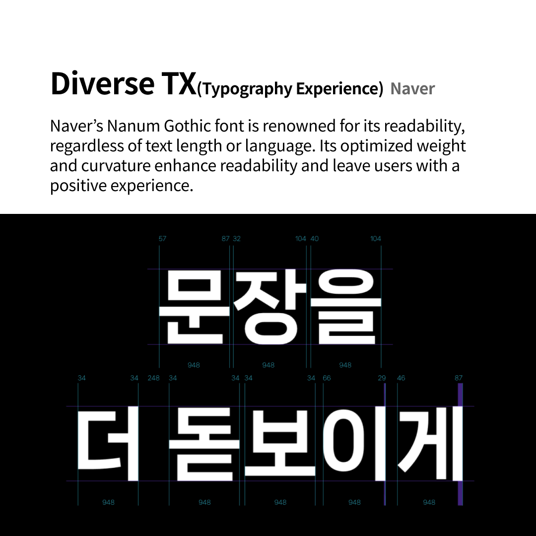
There are examples of companies that provide diverse typography experiences. For instance, Naver’s Nanum Gothic font is designed with optimal thickness and curvature for reading, regardless of text length or language (Korean or English). This helps enhance users’ readability and leaves a positive impression.
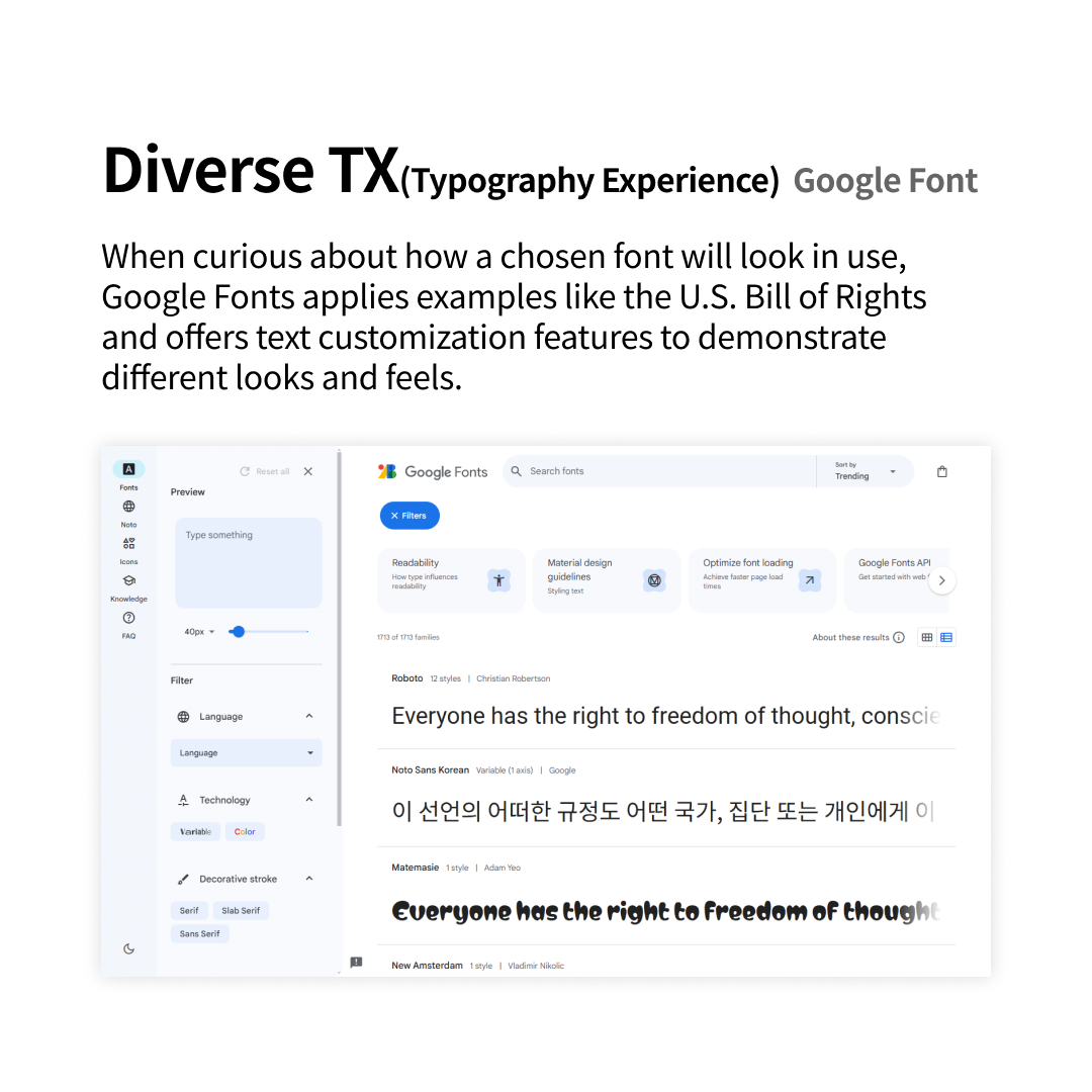
Additionally, Google Fonts offers a feature that allows users to preview and customize text with different fonts, enabling them to experiment with various looks and feels.
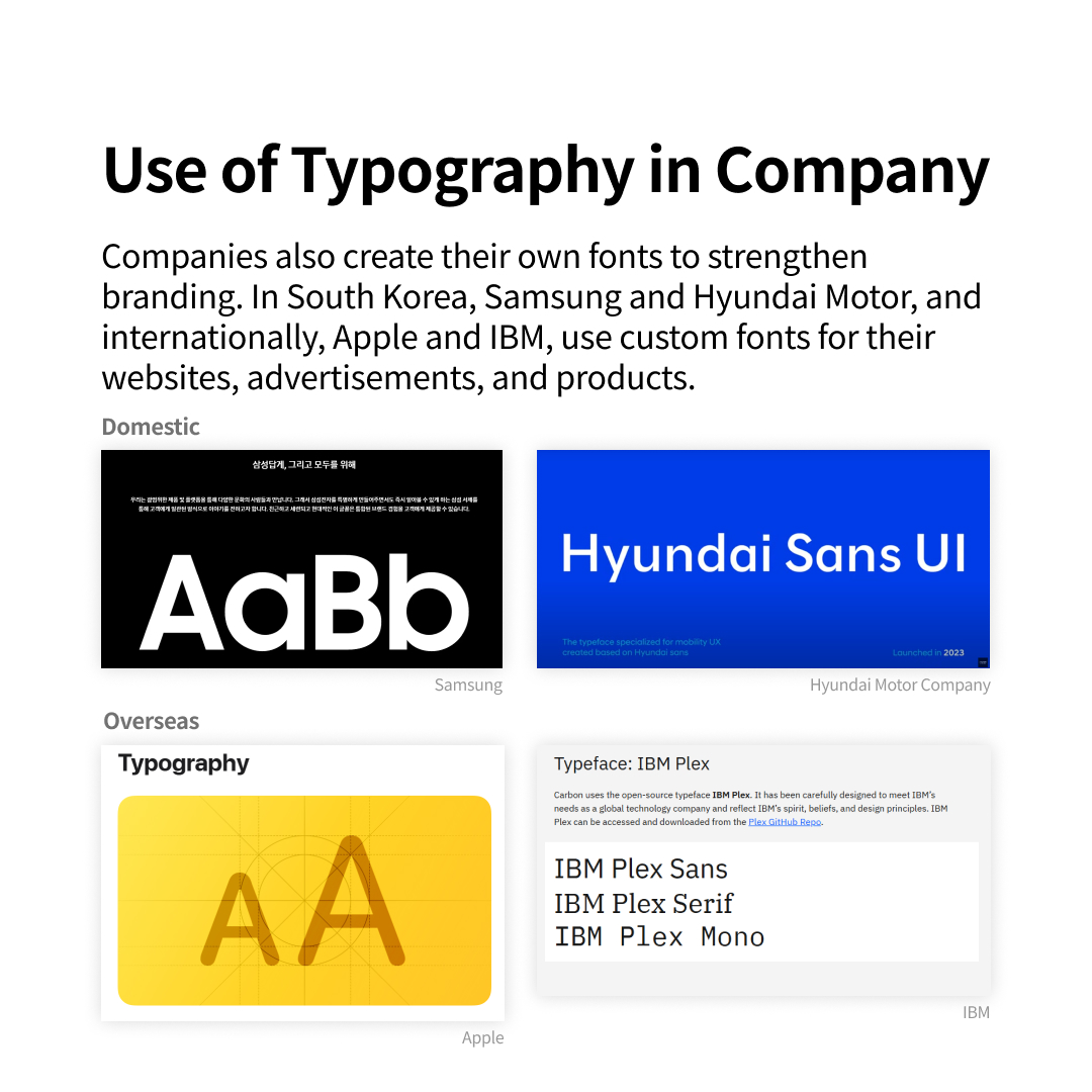
Moreover, companies often develop their own fonts to strengthen their branding. In Korea, Samsung and Hyundai Motors have their fonts, while internationally, companies like Apple and IBM also have their proprietary fonts.
We upload essential trend insights every week. Don’t miss out, stay tuned, follow @5boon_ux for more!
@SALTCAKE ALL RIGHTS RESERVED
